This article is not legal advice. Form builder prices and features are taken from the vendors’ own pages, not from paid accounts of our own; if you see something different, write to konrad@getsharepa.ch.
To create a landing page with a form, start with one goal and a clear picture of your audience. Write a benefit headline, short sections on benefits, process and proof, one call to action and a short form with consent. Then pick a tool, connect your domain, test on a phone, bring visitors and improve based on the conversion rate.
A landing page is a single page with a single job: getting visitors to sign up, enquire or download something. Unlike a website with a menu, it leads nowhere else.
One example runs through every step: Festkinder offers childcare at weddings so parents among the guests can stay and celebrate. The landing page collects enquiries from couples. The company is made up; the enquiry page is real.
Step 1 Set one goal
Decide on the one action visitors should take and how you will measure success. Everything on the page then serves that action.
A landing page with two goals usually achieves neither. Typical goals are an enquiry, a booking, a waitlist sign-up or a download in exchange for an email. Write the goal down as a sentence, plus the number that measures it: the conversion rate, meaning enquiries divided by visits.
Common mistake: building a mini website with a menu, an about page and a blog. Those are exits, not goals.
In the example
Goal: enquiries from couples. Success: at least five enquiries per 100 visits from wedding groups.
Step 2 Describe your audience
Describe who the page is for, what problem they have and what objections they bring. Note the words they use themselves.
When you know your audience, you can use their language and answer questions before they ask them. The most convincing phrases come from conversations, reviews and forum posts. Talk to three to five people and read along where your audience discusses the topic.
Common mistake: industry jargon. Couples search for "childcare at a wedding", not "event-based children's entertainment".
In the example
Problem: parents leave early and "half the dance floor was empty". Objections: is it safe, what if a child misses its parents, what does it cost?
Step 3 Write your value proposition
In one sentence, say what people get and why from you. That sentence becomes your headline.
The value proposition answers every visitor's first question: what's in it for me? It describes an outcome, not a product. A simple template: "[Outcome] for [audience], without [obstacle]." Write five versions and pick the one that sounds least like an advert.
Common mistake: a company name or slogan instead of an outcome. "Moments for young and old" says nothing.
In the example
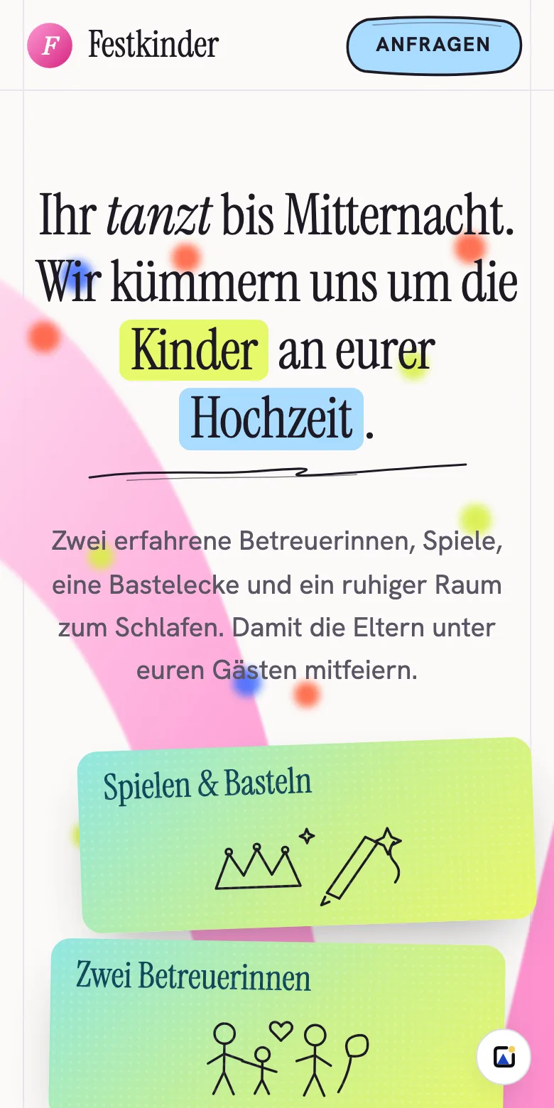
"You celebrate. We look after the kids." The subheading adds how: two carers, 6 pm to midnight, games and a quiet corner for sleeping.
Step 4 Plan the page structure
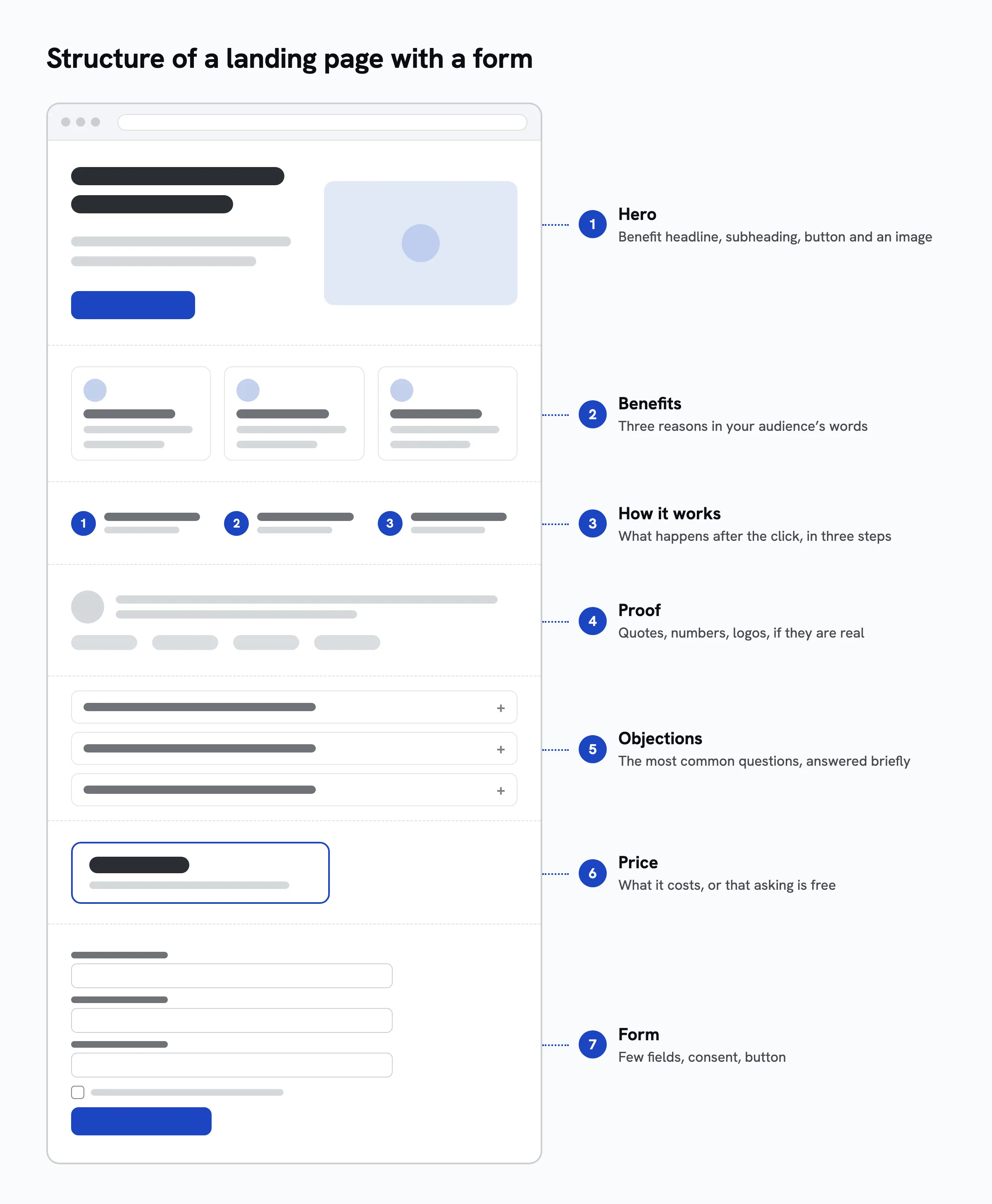
Plan the sections in a fixed order: hero with headline and button, benefits, how it works, proof, objections, price, form. Each answers the question a visitor has at that moment.
Am I in the right place? What do I get? How does it work? Can I trust this? What are the catches? What does it cost? The action comes last. Sketch the page as a list first, and check that headline and button are visible on a phone without scrolling.
Common mistake: starting with the design instead of the content.
In the example
Hero, "What you get", "How it works", "What you can rely on", FAQ, price, form. The button at the top jumps straight to the form.

Step 5 Write the copy
Keep it short and concrete, with benefits instead of features. No paragraph longer than three sentences.
Visitors skim headings and bold text, so every heading has to make sense on its own. A feature like "trained staff" only persuades as a benefit: "you can hand over the kids with peace of mind". Borrow the words from step 2, read the copy aloud and cut whatever trips you up.
Common mistake: superlatives like "unique". Times, numbers and what exactly happens persuade better.
In the example
Instead of "Childcare of the highest standard": "Two experienced carers for your guests' children, from 6 pm to midnight."
Step 6 Write and place the call to action
Label the button with what happens after the click, and place it in the hero and next to the form. Remove links that lead away from the action.
"Submit" says nothing; "Request without obligation" says what happens and that it costs nothing. A short line under the button removes the last hurdle, such as "Reply within two days". The button stands out in colour, is thumb-sized on a phone, and appears two or three times at most with the same label.
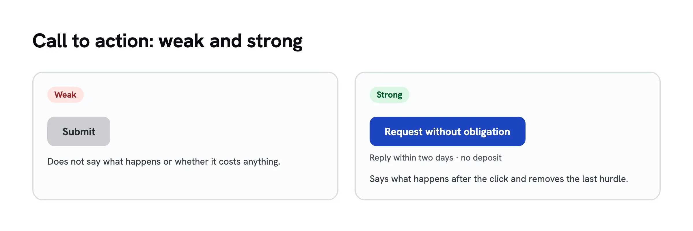
Common mistake: three different buttons side by side. People faced with three choices often pick none.
In the example
Button "Request without obligation", with "Reply within two days · no deposit when you enquire" below it.
Step 7 Design the form
Ask only for what you need to reply properly, and mark optional fields. Every field has a visible label and works on a phone.
Every extra field is a reason to give up, but a well-chosen one saves a follow-up question. Labels sit above the field, not just as grey placeholder text. The right input type helps on phones (email keyboard, date picker), and error messages say what to do.
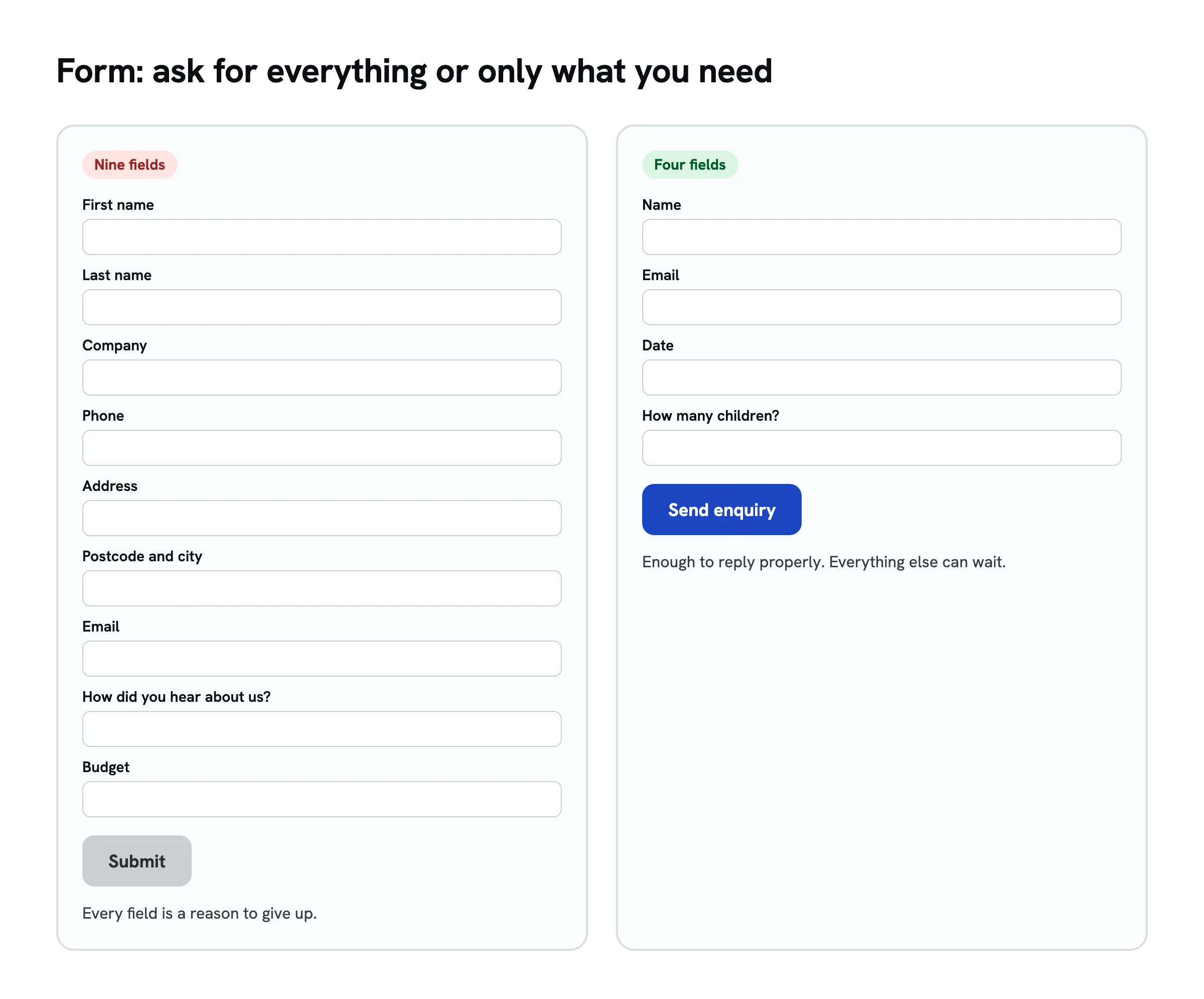
Common mistake: asking for phone, address and company size when an email is enough for the first reply.
In the example
Name, email, date, venue, number and ages of the children, comments optional. Without date and number of children there is no quote.
Step 8 Privacy and consent
Explain in plain words what you use the data for, link your privacy policy, and ask for separate, unticked consent for marketing emails. Add an imprint or legal notice where your country requires one.
Under the GDPR you may only use the data for the stated purpose. Replying to an enquiry is covered by the enquiry itself. Newsletters need consent you can demonstrate and that can be withdrawn as easily as it was given (Article 7 GDPR), usually with double opt-in. Pages run from Switzerland also fall under the Swiss Federal Act on Data Protection, with comparable duties. Third-party services such as fonts, analytics or spam protection belong in your privacy policy. Templates for the notice and the privacy policy, for the EU and Switzerland, are in GDPR contact form.
Common mistake: bundling newsletter consent with sending the enquiry. That consent is not freely given.
In the example
"You may use my details to reply to this enquiry. Nothing else." The page deliberately offers no newsletter.
Step 9 Protect against spam
Protect the form with a hidden honeypot field, and only add Cloudflare Turnstile or Google reCAPTCHA if you need to.
Humans never see the honeypot, bots fill it in, and those entries are discarded. Nobody is bothered. Verification services like Turnstile or reCAPTCHA send visitor data to the provider, so they belong in your privacy policy. Picture puzzles cost real enquiries and shut out many people.
Common mistake: adding the strongest captcha from day one.
In the example
A hidden field is enough: not a single spam entry arrives in the first weeks.
Step 10 Choose a tool and build the page
Choose your tool based on goal, budget and time. Three routes work without code.
| Route | Cost | Effort | Good when |
|---|---|---|---|
| Site builder with a form builder, such as Carrd with forms or Google Sites with an embedded form | Carrd Pro Standard $19 a year; Google Sites and Google Forms free | 1 to 3 hours | you want to assemble the page yourself |
| WordPress, for example on WordPress.com, with a form plugin | free on the provider's address, custom domain from $4 a month billed annually | half a day to a day | you want a full website with a blog later |
| Have an AI chat (Claude, ChatGPT, Gemini) write the page and put it online with a hosting service | free to a few dollars a month | 15 to 60 minutes | you want to move fast and would rather describe than click |
Route 1: site builder with a form builder
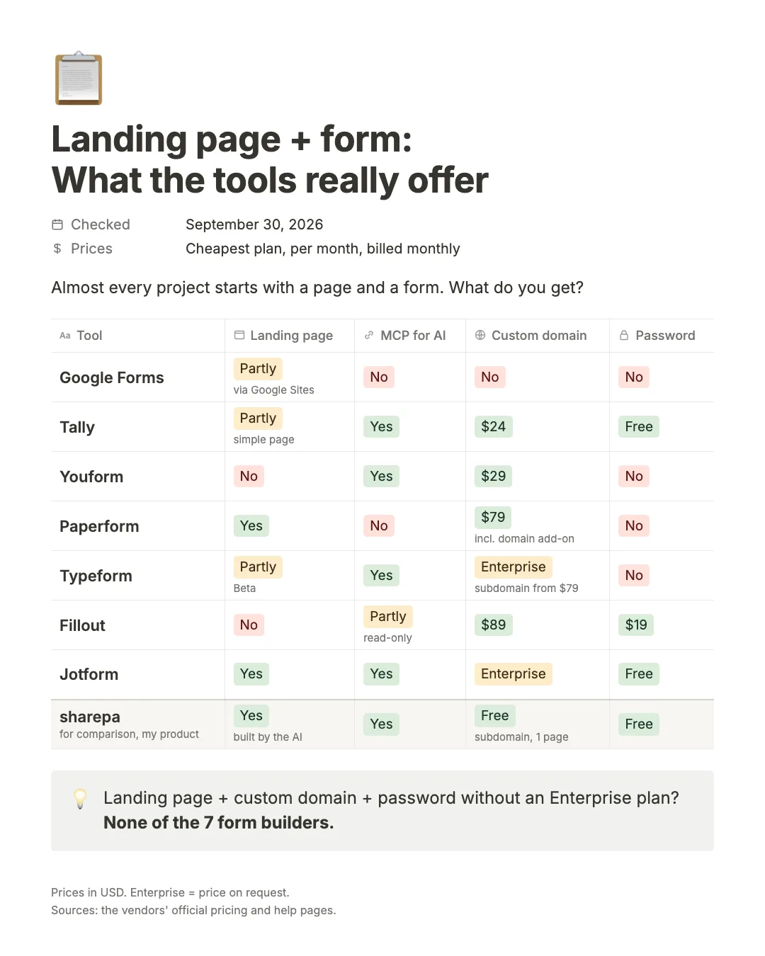
Site builders such as Carrd or Google Sites give you the page; the form often comes from a form builder you embed. Which one fits depends mainly on custom domains and passwords. I compared seven widely used form builders on four questions:
- Landing page: Can I build the page around the form in the same tool?
- Custom domain: Does the form run on my own address, like
signup.mycompany.com? - Password: Can I lock the form behind a password?
- MCP server: Can an AI assistant such as Claude or ChatGPT work with the tool directly?
Prices are for the cheapest plan with the feature, per month when billed monthly, in US dollars. Annual billing is usually 15 to 30 percent cheaper.
Comparison table
| Tool | Landing page | MCP server | Custom domain from | Password from |
|---|---|---|---|---|
| Google Forms | partly, via Google Sites | no | not available | not available |
| Tally | partly, simple page | yes, beta | $24 | free |
| Youform | no | yes | $29 | not available |
| Paperform | yes | no | $79 (plan plus domain add-on) | not available |
| Typeform | partly, beta | yes | Enterprise only, subdomain from $79 | not available |
| Fillout | no | read-only | $89 | $19 |
| Jotform | yes | yes | Enterprise only | free |
Google Forms
Free, quick and familiar to almost everyone. For a club survey or an internal poll it does the job. As a landing page it falls short. Forms always live on docs.google.com, and Google offers no way to use your own domain. There is no password option either: you can require people to sign in with a Google account or limit responses to your organisation, and that is it. If you want a real page, you build it elsewhere, for example with Google Sites, and embed the form there.
*Good for: quick surveys and internal polls where the address does not matter.*
Tally
Tally has a generous free plan with unlimited forms and submissions under fair use. Password protection is included for free, and a custom domain comes with the Pro plan at $24. A Tally form reads like a document and can hold headings, text and images, so it works as a simple one-page site. It is not a landing page builder, though. Tally runs an official MCP server, still in beta, that lets an assistant create forms from a description and fetch submissions.
*Good for: waitlists, sign-ups and small projects where a clean form is enough.*
Youform
Youform works a lot like Tally. It has a free plan and offers a custom domain on the Pro plan at $29. There is no password protection. Its official MCP server comes with every plan and can create forms, edit fields, publish and list submissions.
*Good for: simple forms on your own address when access control is not needed.*
Paperform
In Paperform the page and the form are the same thing. You write as in a document, add images and sections, and the questions sit inside that page. The result feels like a small website. A custom domain costs $59 for the Pro plan plus a $20 domain add-on, so $79 in total. Paperform's own help centre says forms cannot be password protected. There is no dedicated MCP server, only an indirect route through Stepper, the automation product from the same company.
*Good for: a polished single page with a form, when looks matter more than access control.*
Typeform
Typeform is known for one question per screen, which makes a form feel like a conversation. Landing pages are available as a beta called Typeform Pages. A real custom domain is Enterprise only; from the Plus plan at $79 you get a subdomain such as mycompany.typeform.com. Typeform has no built-in password protection. Its help centre suggests a workaround with a hidden field or an access code question plus logic jumps. The official MCP server can build and edit forms and analyse responses.
*Good for: forms where the experience counts, like applications or longer surveys.*
Fillout
Fillout offers a strong free plan with 1,000 responses a month. Access control starts with the Starter plan at $19, as a login page with a password, an email code or single sign-on. A custom domain needs the Business plan at $89. Fillout does not build landing pages. Its MCP server belongs to Zite, an app builder from the same team, and can only read Fillout forms, not create them.
*Good for: gated forms that feed into spreadsheets or a CRM.*
Jotform
Jotform has the largest template library and an AI generator for landing pages that works on the free plan. Password protection is free as well, and the official MCP server can create and edit forms and read submissions. A custom domain, however, is Enterprise only, with pricing on request. The pricing page hints that it might come with the Gold plan, but Jotform's help pages clearly say Enterprise.
*Good for: an all-in-one setup, as long as a Jotform address is fine.*
The two gaps: custom domain and password
The table shows a clear pattern. Every tool handles forms, and most have a usable free plan. The moment you want your own address, prices jump or the option disappears: impossible with Google Forms, Enterprise only with Typeform and Jotform. Password protection looks similar, with four of seven tools offering none.
If you need both, today you end up with Tally at $24 or Fillout at $89 a month, and neither has a real landing page builder. In practice that often means a form builder plus a website builder: two subscriptions, two logins and an embedded form.
Which tool for which job
- Fast and free: Google Forms or Tally.
- Custom domain on a budget: Tally at $24 or Youform at $29.
- With a password: Tally or Jotform, both free, or Fillout from $19.
- Page and form in one: Paperform or Jotform.
- Working with an AI assistant (MCP): Tally, Jotform, Typeform or Youform.
Route 2: WordPress
For a single landing page WordPress is more than you need, but it pays off if the page should grow into a full website with a blog. The form comes from a plugin. Expect more time for setup, themes and updates.
Route 3: a page from an AI chat, put online
Claude, ChatGPT and Gemini will write a complete landing page with a form if you describe what should be on it. Give them audience, benefits, sections and fields from steps 1 to 9 and refine in conversation. For an address on the web and stored submissions, you need a hosting service.
Disclosure: sharepa is my own product and one of these services. You build the page with Claude or ChatGPT, and sharepa puts it online at your-page.sharepa.page or on your own domain. Submissions land in the sharepa app, you get an email when new ones arrive and can download them as CSV. Three pages are free with a small sharepa note, one of them on your own domain (as a subdomain), plus password protection and the connector for Claude and ChatGPT. The Festkinder enquiry page: festkinder.sharepa.page (in German).
A form builder is the better choice if you want a drag-and-drop editor, need branching logic, payments or file uploads, or run many forms side by side. sharepa does none of that.
Common mistake: choosing the tool with the longest feature list. What counts is speed, a clean page on mobile and a form that delivers.
In the example
Festkinder describes the page section by section in Claude and puts it online. From the first sentence to the finished page takes about an hour.
Step 11 Connect your own domain
Connect your own domain or subdomain so the page runs under your name. Usually one CNAME record at your domain provider is all it takes.
Your own address looks more trustworthy, and you can switch tools later without breaking links. A subdomain like enquiry.mycompany.com is often enough; a new domain costs around $10 to $20 a year. Your tool shows you the DNS record, you add it at your provider, and the HTTPS certificate usually follows automatically.
Common mistake: pointing your root domain at the landing page when your website already lives there.
In the example
Festkinder starts on the tool's address. Once enquiries come in, enquiry.festkinder.example is the plan.
Step 12 Thank-you page and confirmation email
After submission, show a thank-you page that says what happens next and when. If your tool sends emails, add a short confirmation.
Right after submitting, people wonder whether it worked and when they will hear back. A good thank-you page has three parts: it worked, what happens by when, and a next step.
Common mistake: just "Thanks". People then write again a day later, or ask a competitor.
In the example
"You will get a proposal for your evening within two days." Plus: "Ask your venue about a quiet room for the kids."
Step 13 Process the submissions
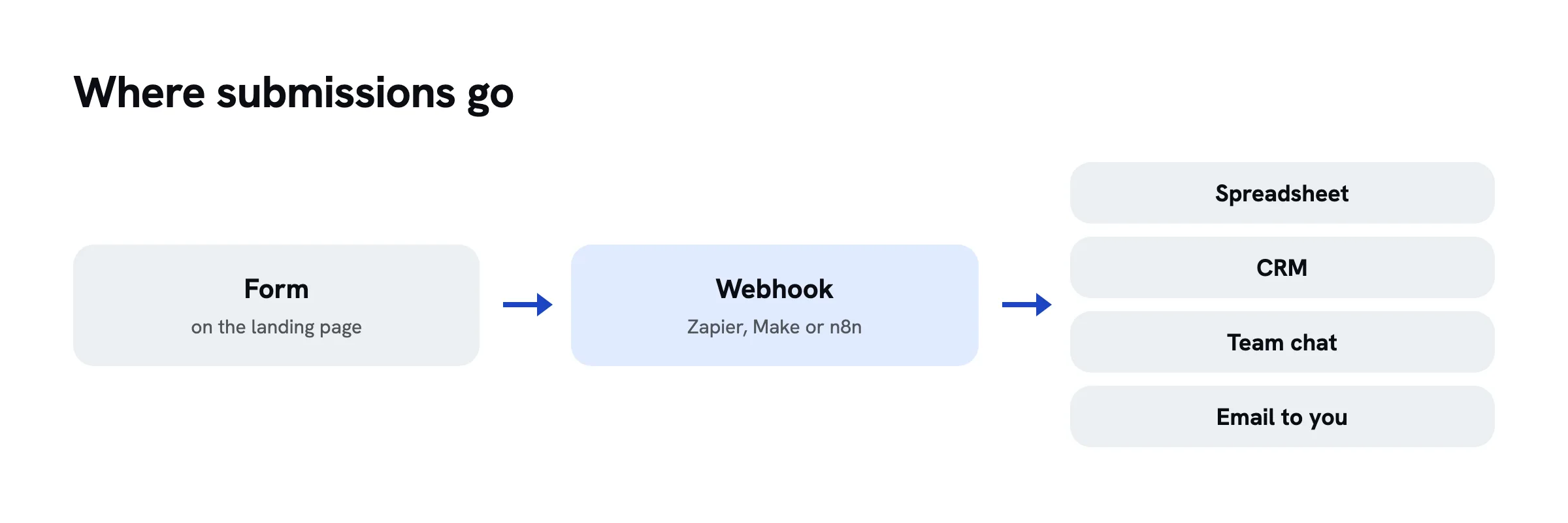
Decide where submissions go and who handles them when. A webhook with Zapier, Make or n8n automates it.
An enquiry left for three days is often lost. To start, an email for each submission and a spreadsheet noting when you replied is enough. As volume grows, many tools send every submission to a webhook, which automation services pass on to your spreadsheet, CRM or team chat.
Common mistake: leaving submissions in the tool and rarely looking.
In the example
An email for each enquiry, plus a sheet with date, venue, children, replied on and outcome. Above ten enquiries a week, a webhook fills the sheet.
Step 14 Test before launch
Go through the page on a phone and a computer, send a test entry and check that it arrives.
A broken form costs every single enquiry. Check: does it load fast, are headline and button visible without scrolling, does the test entry arrive, does the thank-you page appear, do all links work, are imprint and privacy policy reachable? Also ask someone who has never seen the page.
Common mistake: only testing on a computer. Most visitors from social media arrive on a phone.
In the example
On an older phone the date picker is fiddly. The test entry arrives.
Step 15 Bring visitors to the page
Send people from your audience to the page and give each channel its own link.
In the first weeks nobody finds the page on their own. Channels you already have work fastest: your network, customers, a newsletter, partners with the same audience. Ads bring predictable traffic but cost money. Campaign parameters like ?utm_source=instagram show which channel brings enquiries.
Common mistake: sharing the page once and waiting.
In the example
Three wedding groups, two wedding planners and flyers at a venue, each with its own link or QR code.
Step 16 Measure and improve
Track visits and enquiries per channel, work out the rate and change one thing at a time.
For orientation, Unbounce's Conversion Benchmark Report gives a 2024 median of 6.6 percent, with industry medians from 3.8 to 12.3 percent. What matters more is whether your own rate rises with each change. Change the headline, button, fields or price one at a time, and compare only after enough visits. Below about 100, a difference is usually noise.
Common mistake: changing several things at once.
In the example
After 200 visits Festkinder converts at 4 percent. First change: the subheading becomes a sentence a couple used in conversation.
Checklist
Checklist
Questions
What should a landing page include?
A benefit headline, a subheading, one clear call-to-action button, short sections on benefits, how it works and proof, answers to the most common objections, a price if it fits, a short form with a privacy note and, where required, an imprint. A menu and links that lead away from the action do not belong on it.
Can I create a landing page with a form for free?
Yes. Google Sites with Google Forms, the free WordPress.com plan with an embedded Tally form, or a free plan for pages written in an AI chat cost nothing. The page then usually runs on the provider's address. A custom domain costs something on most routes, the domain itself around $10 to $20 a year.
Can you password protect a Google Form?
Not natively. Google Forms has no password setting. You can require a Google sign-in or restrict responses to your organisation. A common workaround is a first question whose answer must match a word through response validation. That keeps casual visitors out but does not protect anything sensitive.
Can Google Forms use a custom domain?
No. A Google Form always runs on docs.google.com or forms.gle. To show it on your own address, embed it in a page you control, for example a Google Sites page, which does support custom domains.
Can you password protect a Typeform?
Not with a built-in setting. Typeform's help centre describes a workaround: a hidden field or an opening question asks for a code, and logic only lets people with the right code continue. For real password protection, look at Tally, Jotform or Fillout.
Sources
- Typeform Pricing, retrieved on 30.09.2026
- Restrict access to or password protect your typeform, Typeform Help Center, retrieved on 30.09.2026
- Custom domains, Typeform Help Center, retrieved on 30.09.2026
- Create a landing page with Typeform Pages (beta), Typeform Help Center, retrieved on 30.09.2026
- Typeform MCP server, Typeform Developers, retrieved on 30.09.2026
- Tally Pricing, retrieved on 30.09.2026
- Custom domains, Tally Help, retrieved on 30.09.2026
- Password protect forms, Tally Help, retrieved on 30.09.2026
- MCP, Tally Developer Docs, retrieved on 30.09.2026
- Jotform Pricing, retrieved on 30.09.2026
- How to use custom domains with Jotform Enterprise, Jotform Help, retrieved on 30.09.2026
- How to password protect a form, Jotform Help, retrieved on 30.09.2026
- Jotform MCP server, Jotform Developers, retrieved on 30.09.2026
- AI Landing Page Generator, Jotform, retrieved on 30.09.2026
- Fillout Pricing, retrieved on 30.09.2026
- Login page, Fillout Help, retrieved on 30.09.2026
- MCP overview, Zite Help, retrieved on 30.09.2026
- Paperform Pricing, retrieved on 30.09.2026
- Can I password protect a form?, Paperform Help, retrieved on 30.09.2026
- Youform Pricing, retrieved on 30.09.2026
- Connect an AI assistant to Youform, Youform Help, retrieved on 30.09.2026
- Choose who can respond to your form, Google Docs Editors Help, retrieved on 30.09.2026
- Configure the Google Workspace MCP servers, Google for Developers, retrieved on 30.09.2026
- Use a custom URL for your site, Google Sites Help, retrieved on 30.09.2026
- Conversion Benchmark Report 2024, Unbounce, retrieved on 20.10.2026
- Carrd Pro, pricing and features, retrieved on 20.10.2026
- WordPress.com Pricing, retrieved on 20.10.2026
- Regulation (EU) 2016/679 (General Data Protection Regulation), EUR-Lex, retrieved on 20.10.2026
- Federal Act on Data Protection (FADP), Fedlex, retrieved on 20.10.2026
- Cloudflare Turnstile, Cloudflare Docs, retrieved on 20.10.2026
- reCAPTCHA, Google for Developers, retrieved on 20.10.2026